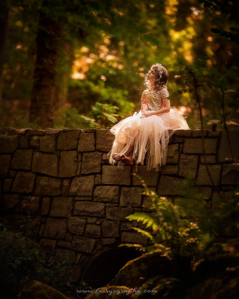
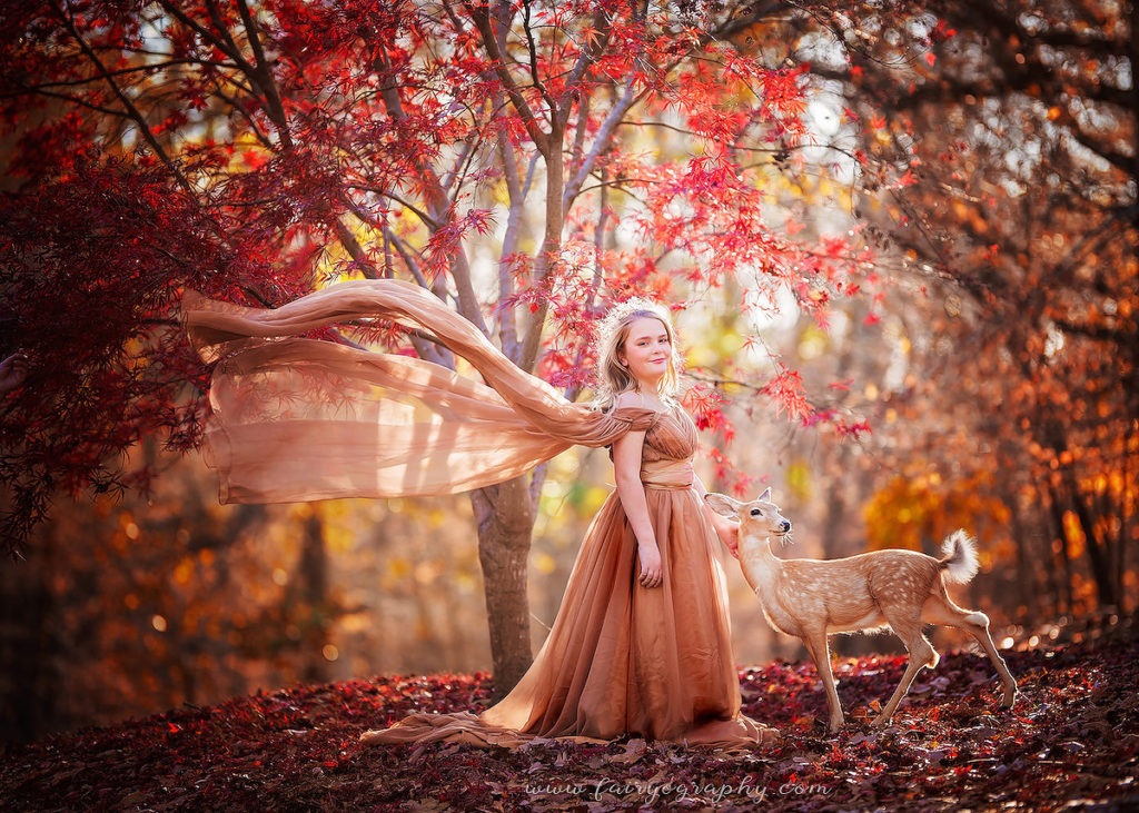
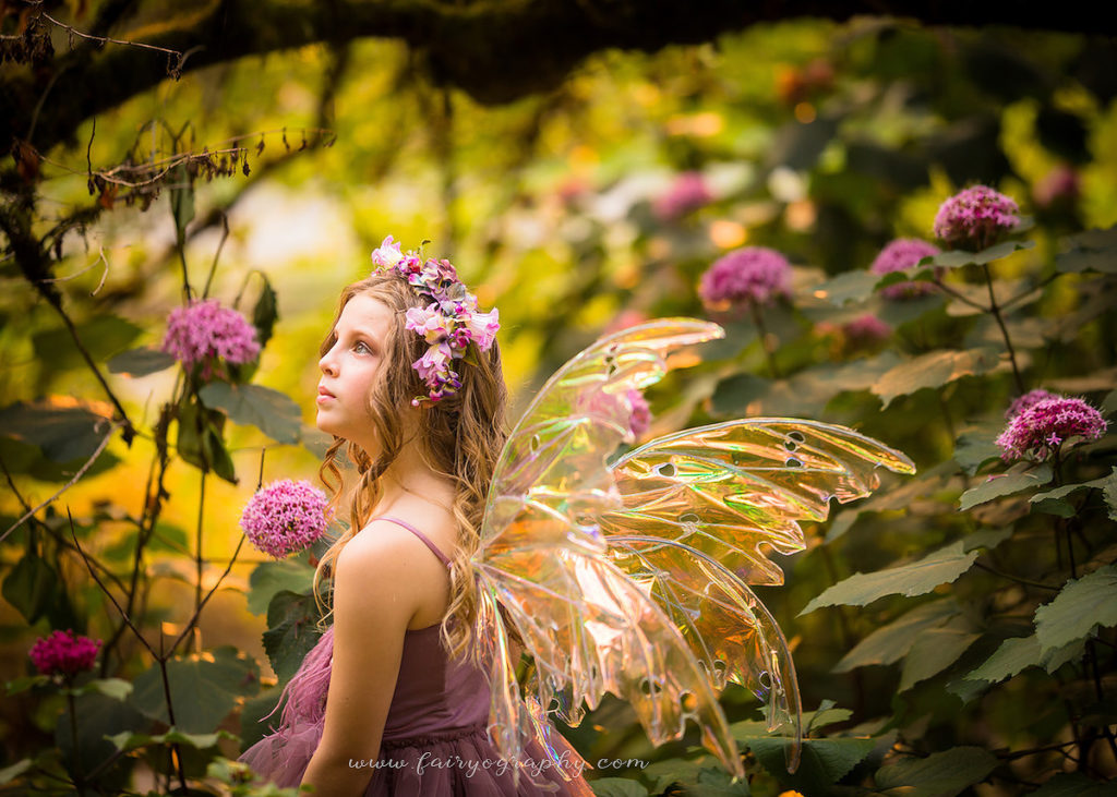
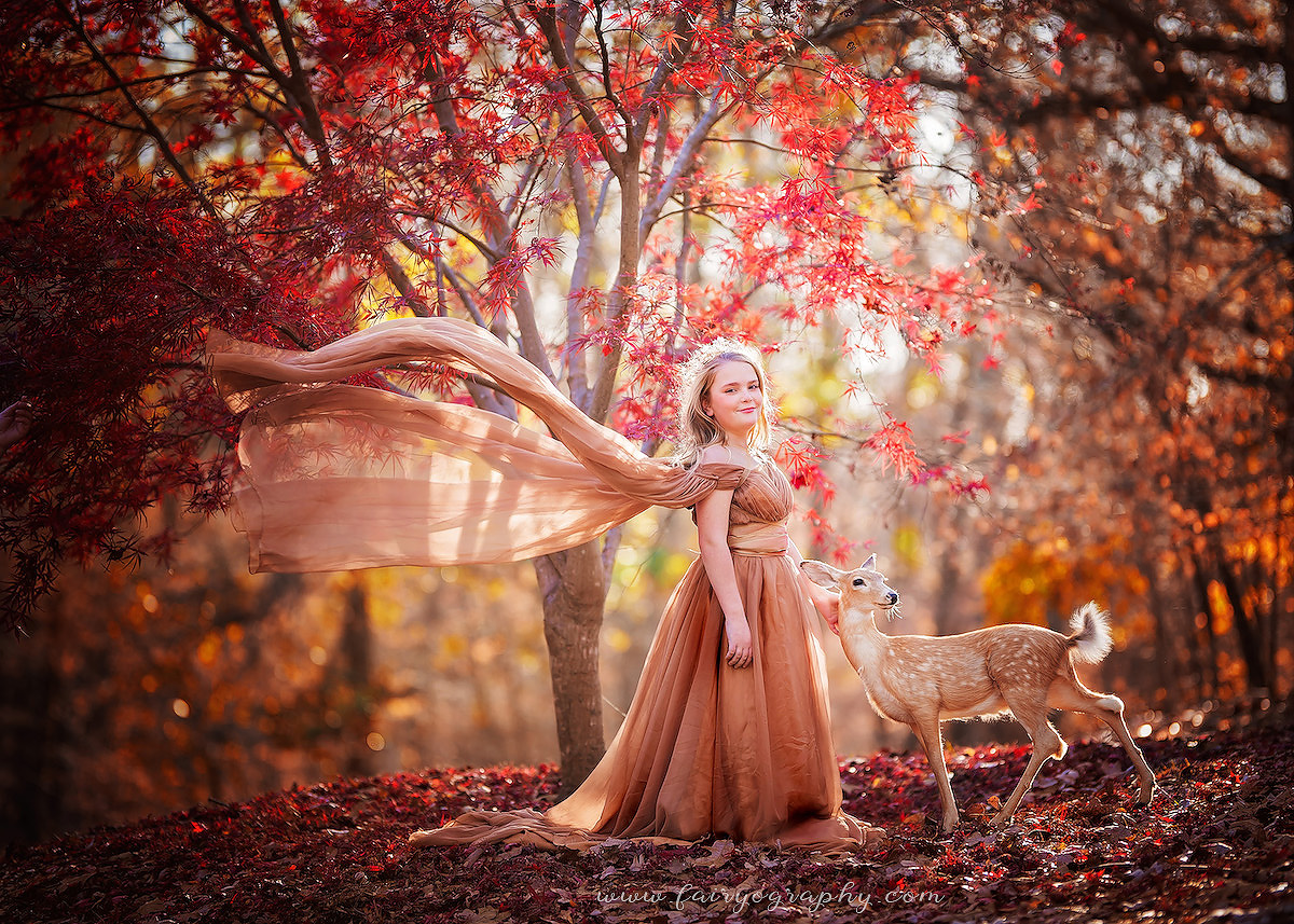
If you take a look at my website, you’ll notice that every single image on the website is in color. Why is that?

Color is part of my style
I have a lot of clients come in and say “normally I love black and white, but your color! “I’ve been in business for 18 years now, and at this point my feeling of color is as much a part of my style as what I shoot. Every artist has a style. Not only a style in what they see and choose to record, but also in how they recorded and edited later. Color is an important part of how I choose to tell each story.
Vibrant color is how I see the world
Vibrance is part of how I literally see the world. I plant my garden for jewel tones, I buy the clothes that I wear based on the colors that I like. My husband and I always talk about what I see versus what he sees. He is somewhat colorblind, and I’m nearly convinced that I see a bit more color than everyone else does. Or at least, that’s the way it seems in my imagination. Every photo I take always seems like a less vibrant and less saturated and less golden copy of what I really saw. So I edit each of my photos to reflect what I actually saw while taking the picture that day.

Imagination is colorful
Have you ever read a children’s storybook that was illustrated in black-and-white? I sure haven’t. Most kid’s picture books are illustrated in bright vibrant colors. Some of them even include sparkle holograms or metallic bits. Even the children’s books that are not illustrated speak a lot of color. Charlie has his golden ticket, the secret garden is lush and green, Harry’s wand is nubbly chocolate brown. I feel like this is because children imagine in vibrant color and see the world in rosy tones.
Color is part of a feeling
Remember how in the Wizard of Oz the movie famously changes to technicolor when Dorothy leaves canvas and arrives in Oz? Probably one of the most breathtaking moments in cinematic history. Or maybe the movie Pleasantville when the mother actually uses her makeup to cover up the color of her skin? The whole tone of a movie or a scene can be set or changed with color. The Disney version of Pocahontas uses zero red throughout the whole of the movie, until near the end where the sky is the red and orange of fire as the two groups prepare for war.
I like to use color in a somewhat monochrome way, so that the focus is all on the girl’s face. A yellow dress in a field of purple flowers would really stand out, but a purple dress in those same purple flowers allows the viewer to look at the child instead of the gown.


leave a comment